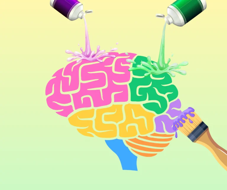
Every day, we make dozens of decisions influenced by colors, often without even realizing it. Color psychology in marketing is a powerful tool that helps brands establish an emotional connection with their audience, influence purchasing decisions, and increase conversion rates. Understanding how different shades affect consumer perception and behavior can become your competitive advantage.
The Impact of Color on the Customer
Research shows that up to 90% of instant judgments about products are based on color. This is no coincidence, as colors trigger physiological and psychological reactions that have developed over thousands of years of evolution.
When a potential customer first sees your brand, logo, or website, color becomes the first channel of communication. It conveys a message faster than text, creates a first impression, and determines whether the person wants to interact with your product further.
A well-chosen color palette can increase brand recognition and significantly influence purchasing decisions. For example, red accelerates the heartbeat and creates a sense of urgency, which is why it is often used for “Buy Now” buttons or sale announcements. Blue, on the other hand, inspires trust and calmness, making it a favorite for banks and medical institutions.
How Color Influences Consumer Behavior
Color works on a subconscious level, activating certain emotions and associations. This mechanism operates through several channels simultaneously.
Emotional response – the first thing that happens when encountering a color. Warm tones (red, orange, yellow) excite, creating a sense of energy and optimism. Cool shades (blue, green, purple) calm, instill confidence, and convey seriousness. Brands use these properties to create the desired atmosphere.
Cultural context also plays a crucial role. What symbolizes joy in one culture may be associated with mourning in another. Global brands always consider these nuances when entering new markets.
Decision-making speed directly depends on the color scheme. Bright, contrasting colors grab attention and encourage quick actions, which is why they are used for Call-to-Action elements. Pastel and neutral tones promote longer content engagement and thoughtful decisions.
Perceived product quality changes depending on packaging or design color. Black and gold convey luxury and premium quality, brown and green suggest naturalness and eco-friendliness, and bright neon colors communicate innovation and youthfulness.
Colors in Branding
Choosing a brand color palette is a strategic decision that shapes a company’s identity and market perception.
Red – the color of passion, energy, and action. It raises blood pressure and speeds up metabolism, creating a sense of urgency and importance. Brands seeking to appear bold, dynamic, and emotional often choose red. Ideal for entertainment, fast food, and sports industries.
Blue conveys trust, stability, and professionalism. It is the most popular color in the corporate world, especially among tech companies, financial institutions, and healthcare organizations. Blue reduces tension and creates a sense of reliability.
Green is associated with nature, health, and harmony. Perfect for eco-friendly brands, organic products, the health industry, and financial services (symbolizing growth and prosperity). Green soothes the eyes and creates a sense of balance.
Yellow – the brightest color in the spectrum, symbolizes optimism, happiness, and creativity. It immediately attracts attention but can be tiring in large amounts. Yellow works well for children’s brands, the food industry, and companies aiming to appear friendly and approachable.
Orange combines the energy of red with the joy of yellow. It evokes enthusiasm and friendliness, encourages action, but less aggressively than red. Ideal for tech startups, creative agencies, and youth-focused brands.
Purple is traditionally associated with luxury, creativity, and spirituality. It is the rarest color in nature, making it automatically perceived as unique and special. Premium brands, cosmetics companies, and creative industries often choose purple.
Pink symbolizes tenderness, care, and romance. Depending on the shade, it can appear delicately feminine or modern and bold. Frequently used in beauty, fashion, and women-focused brands.
Black embodies elegance, power, and sophistication. It creates contrast, adds weight, and conveys seriousness. Luxury brands, premium products, and companies seeking an authoritative and modern image often choose black.
White symbolizes purity, simplicity, and minimalism. In design, it creates space, allows other elements to stand out, and is associated with innovation. Ideal for tech companies, healthcare, and minimalist brands.
Practical Tips
Implementing color psychology in a marketing strategy requires a systematic approach. Start by analyzing your target audience: who they are, what matters to them, and which emotions you want to evoke. Younger audiences respond better to bright, contrasting colors, while mature audiences prefer calm and balanced palettes.
Test different options. A/B testing colors of buttons, headings, and accent elements can yield surprising results. Sometimes changing a shade by just a few tones can increase conversion rates by 20–30%.
Maintain consistency across all customer touchpoints. If your website uses one color scheme, but your chatbot uses another, it creates cognitive dissonance and reduces trust in the brand.
Consider context. Colors that look great on desktop may appear differently on mobile devices or under different lighting. Test your palette on various screens and in different conditions.
Don’t forget accessibility. About 8% of men and 0.5% of women have color vision deficiencies. Ensure sufficient contrast and do not rely solely on color to convey critical information.
Color psychology is both a science and an art. Proper use of colors in marketing can become your superpower, helping you stand out among competitors, build an emotional connection with your audience, and improve business results.
Every shade, every accent works toward your goal – creating a memorable experience, increasing loyalty, and boosting conversion.
Start small: analyze your current color palette, determine the emotions it evokes, and consider whether it sends the message you want. Even small changes can sometimes produce impressive results